Babylon
User study on User-selected Icons for Tangible Handheld Devices
- 22 May 2024
- ⌘
- 3 min read
Table Contents
[ Blog Under Construction … ]
This is the sequel study of my thesis, which was planned to be the fourth part. Although due to time and I wanted to have a narrower focus in my thesis, I skipped the Icons Stage.
1. Background
Human always needed and used some sort of iconography or acronyms for the machine interfaces. It can be massive “machines” like submarine, space shuttle or cars to small and simple ones we have in our home like a microwave oven or radio.
I have been taking photos of hundreds of those machine on dozens of countries I visited for years.
On small machine that we can carry in our pockets are called handheld devices, which aren’t have that much widely use few decades ago, compared to the other machines, in the past we may only have remote controls.
2. User Study: Button Labeling
In my study, the participants were first asked to take from a lottery jar a paper; on the paper will be one of the six alphabets I previously selected.
Afterwards, the participants will be asked to use the characters of that alphabet to label the function of the
3. Possible Contributions
- Insights for designing Smart home controllers
- Iconography for future Controllers
4. The Alphabets
Six alphabets were chosen for the task. Grouped into two groups, one with four and the other with two alphabets. Each of the four alphabets will be presented to half of the participants, while two alphabets will be presented in alphabetical order to all the participants. The latter two have been presented in a different order to each participant using the Latin Square, have only eight letters, matching the number of the Interaction Elements of the Tangible User Remote Interface.
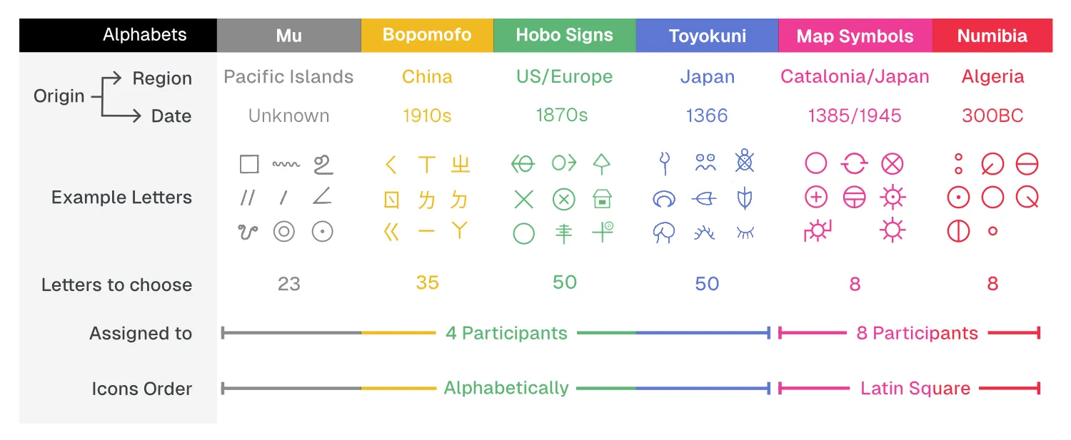
I listed the following four rules that the alphabet should have:
- The alphabet should be an alphabet which the participant hasn’t used before, in order to lower the possible bias.
- The alphabet letters should not be too complex, so as to be easy to visually identify on tiny buttons.
- The alphabet should have a comprehensive number, a wide variety of shapes of letters for the participant to choose.
- The alphabet should be a more symmetric and square-proportioned one, to fit well in a button.
Mu Alphabet
[…]
from Fiji
Bopomofo
Bopomofo is a 37-letters alphabet really squared shaped, symmetric, right angled alphabet similar complication
ㄅ ㄆ ㄇ ㄈ ㄉ ㄊ ㄋ ㄌ ㄍ ㄎ ㄏ ㄐ ㄑ ㄒ ㄓ ㄔ ㄕ ㄖ ㄗ ㄘ ㄙ ㄚ ㄛ ㄜ ㄝ ㄞ ㄟ ㄠ ㄡ ㄢ ㄣ ㄤ ㄥ ㄦ ㄧ ㄨ ㄩ
Hobo Signs
Hobo signs where used by migrant and homeless people in Europe and the US since the beginning of the 19th century. Used to communicate information about train schedules, directions, and other useful local information.
Toyokuni Script
It is a 50 characters alphabet.
- have current japanese characters
- some detailed
- some really abstract messy
Map Symbols
Numibia
5. Research Methodology: Icons Selection
Matuda’s book “ZERRO” (2021)[^1] offers an extensive collection of alphabets and icons from various global contexts, including professional, religious, medical, mathematical, and pseudo-scientific domains. This diverse compilation served as a significant source of inspiration, guiding me in the exploration and selection icons suitable for my user experiment. To ensure a systematic selection process, several guidelines were followed.
Icons or letters chosen should be unfamiliar to users, avoiding commonly recognized symbols such as the three-line hamburger menu and frequently used numbers to minimize potential bias. Complexity was a key consideration, with a preference for icons that are not overly complex or intricate and can be effectively rendered in small sizes. Furthermore, most of them need to have the same proportions, and tend to choose more square proportioned alphabets.
The alphabets I’ve chosen each contain a wide range of letters, providing a good mix of options, ensuring there’s plenty of variety while still keeping it simple for participants to make their selections without feeling overwhelmed. Consistency in proportions was another important criterion, with a preference for icons that maintain uniformity in size and shape, preferably square or square-proportioned when inclined. These guidelines facilitated a methodical evaluation and selection process, leading to the identification of icons best suited for the intended experimental purposes.
6. Results
7. Conclusions
8. References
[1]: Matuda, Y. [松田行正]. (2021) ZERRO 零【初版紅.複刻珍藏版】:世界記號大全 (Traditional Chinese Edition). 漫遊者文化.